PLUS! The hat that had all tongues wagging!

Jean says: On Thursday afternoon, May 19th, I flew in to LaGuardia from New Orleans, dropped my luggage at my apartment, grabbed a hat, reapplied my lipsick, and ran out the door. I had to be across and uptown at 38 W. 86th Street (at the The Bard Graduate Center: Decorative Arts, Design History, Material Culture) to meet Valerie and get seated before 6 PM for a wonderful program entitled: "Working Fabric: Innovation in Design at Knoll Textiles". It was the first of a series of three "Conversations" with designers (part of a larger series of 13 events including conversations, a walking tour, a concert, three lectures and two forums) related to Bard's exhibition Knoll Textiles, 1945-2010, which runs from May 18 through July 31, 2011. In the May 19th Conversation, moderated by Brooke Hodge, with menswear designer Jhane Barnes and Knoll Creative Director Dorothy Cosonas sharing their collaborative experiences with Knoll, which have involved the industry's most technologically advanced production methods and materials. (See, kiddies, we're not totally shallow and self-absorbed. We are true seekers of knowledge and wisdom -- we just like to dress for the occasion.) I have always loved Knoll's modernist tradition but my sentimental favorite timeframe was the 1980s when two of my most talented and creative friends, Lee Stout and Kim Dennis, worked for Knoll. I loved the layout and the feel of the Soho showroom.
(Note: At a certain point in time, Knoll Textiles morphed into KnollTextiles, so you will see two different spellings, depending on the era of the particular item under discussion.)

The first comprehensive exhibition devoted to a leader and producer of modern textile design, Knoll Textiles encompasses all four floors of the gallery, organized around four themes. Inescapably obvious throughout the show are the leadership of Florence Knoll and the creativity of the design directors in the formation, shaping and dissemination of the Knoll brand and the promotion and marketing of its textiles. From the company's founding in the late 1930s, Knoll has had a significant impact not only on modern postwar interior design but also on furniture and textile production.
When she retired in 1965, Florence Knoll had been design director and led the Knoll Planning Unit and Knoll Textiles. On Sunday morning, Valerie and I returned to the scene of the crime to view the exhibit. Although we had the place to ourselves, we were prohibited from taking photos or from climbing onto the furniture or rubbing our grimy mitts on the gorgeous textiles. (Imagine!) Valerie has downloaded some photos from Bard's website to give you a flavor of the exhibition. Note: Our blog has a temporary redistribution of labor: Since my camera is on the fritz and had to be returned to the Pentax mothership for neurosurgery, Valerie has had to not only shoot most of the photos but also edit and upload them. Consequently, your truly is taking up the slack by handling the yeoman's (or should I say: "Yo, woman's"?) share of the writing. (Valerie says: I could have made a new camera by hand in the amount of time it's taking the fix-it wizards to return Jean's Pentax. One supposes their repair experts have been downsized to maximize shareholder return. [Otherwise known as keeping one's priorities straight.])
Dorothy Cosonas' Knoll Luxe collections include amazing pieces by the fashion designers Kate and Laura Mulleavy for Rodarte and Jack McCollough and Lazaro Hernandez for Proenza Schouler:

Above is a Knoll Luxe swatch of Willow upholstery fabric from Proenza Schouler's Mepal collection.

Above is the Landscape swatch from Auden, Rodarte's Knoll Luxe drapery fabric. The shimmer, and very little of the subtle color shift, is visible in the photo. In person it's a knockout. Kate and Laura named each section of their collection after poets. Unfortunately, we don't have a photo of Dorothy Cosonas' amazingly transparent reinterpretation of Ross Littell's 1958 colorway Mira ("Red/Orange/Persimmon") which hangs from the fourth floor stairway of Bard's Main Gallery and continues down to the first floor, visually connecting the designs of the past to the present.

This iconic Small Diamond chair by Harry Bertoia, circa 1955, is covered in the gorgeously lush Prestini fabric by Antoinette Lackner Webster.

This circa 1966 wall hanging titled Spheres is by Ross Littell.

The catalog photograph of this Model 657W rocking chair circa 1945 by Ralph Rapson with cotton webbing by Marianne Strengell doesn't do it justice. While Valerie was dying to touch the textiles, especially the draperies and wall hangings, I was dying to sit on all the furniture. This rocking chair was irresistible. I really wanted to take it for a spin.

Knoll Textiles sample kits circa 1967 were designed by Lella and Massimo Vignelli.

Knoll red upholstery fabric swatch.

Knoll Delta fabric swatch.

This is a detail from "Good Catch", a 1965 advertisement by Herbert Matter.

Here's a shot of Brooke Hodge seated between the two speakers. Rebecca Allen, Head of Education for Bard Graduate Center, was the evening's hostess, introducing Brooke, Dorothy and Jhane. The venue was terrific and the speakers were very approachable. That they served wine and light snacks didn't hurt. It was a great icebreaker. When I was speaking with Rebecca after the program, she mentioned the upcoming exhibition opening in mid-September: Hats: An Anthology by Stephen Jones organized by the Victoria and Albert Museum, London. You can bet we'll be there for that one! (Valerie says: one of the perks of traveling as a pair is that our chutzpah levels rise and fall independently. When Jean elbowed me to photograph the speakers, my chutzpah level was flagging, so I handed her the camera. Jean gamely rose to the challenge. Unfortunately, she accidentally put the first picture on ten second timer [with a beeping countdown], and the second on flash. This is one of those photos. Having brought unwanted attention to ourselves twice, we wordlessly resolved to take no more photos until afterwards.)
Jhane Barnes is director of Jhane Barnes Menswear, a men’s ready to-wear company. She also designs interiors, carpeting, eyewear, and office furniture for such companies as Google, PepsiCo, LensCrafters, Rolls-Royce, and SONY. Jhane wore a graphic Issey Miyake dress. The light patches are actually a kind of lime green, which sadly don't show up in the photo. (Our excuse is that the room was dark.) During her presentation, she called upon her husband, who happens to be Japanese, when she couldn't remember a specific fact about one of the many high tech menswear shirts she passed around the audience to see and feel.

Here's a better picture of Brooke Hodge, who moderated the evening's Conversation. Brooke is Director of Exhibitions and Publications at the Hammer Museum in Los Angeles. She wore a terrific black and white Marimekko dress. At the conclusion of the program when we were chatting, we complimented her on her dress -- and on the amazing Japanese coat she was holding: It had a textured persimmon yellow image which looked like a velvet wood cut of a tree on the exterior and a grey and white striped silk lining which she so kindly modeled for us!
When she was at MOCA, Brooke Hodge curated an exhibition we wish we’d seen, entitled Skin + Bones: Parallel Practices in Fashion and Architecture. For a look at this very interesting exhibition, shown 2006 – 2007 at the Museum for Contemporary Art in Los Angeles, http://www.moca.org/media/gal_guides/sb_galleryguide.pdf
click here.

Standing between Valerie and Brooke is Dorothy Cosonas who has received numerous awards, including the Best of NeoCon Gold for many of her KnollTextiles upholstery collections, as well as her inaugural collection and her collection with Rodarte for Knoll Luxe.
Jean says: While researching this posting, I was reminded of how much my own office is an homage to Knoll. My desk is a lipstick red square PaperClip Table (1964 design by Massimo and Lella Vignelli), I sit on a Life Chair, and my typing table is a red Knoll boomerang table (KnollStudio Essentials Interaction Adjustable Table).

My Knoll PaperClip Table looks like this. It has a red top with black edging and black powder-coated metal legs.

The fact that I regularly put in in 12-hour days at the office is a testament to the comfort of my Knoll Life Chair. Mine is in deep charcoal. I spend so much time in that chair, I'm beginning to suspect I share a blood flow with it!

My laptop sits on a bright red boomerang-shaped Knoll Esentials Interaction Adjustable Table that looks like this, only with a bright red top and black metal base. I occasionally readjust the height of my table and my chair for variety.

Valerie says: The evening's conversation was timed so guests would be able to tour the exhibition afterward, but we spent so much time chatting that there was no time to see the show, and we had to come back. Following our tour through the exhibition on Sunday, we had a little sit-down (as women of a certain age are wont to do) at a place called Joe, as in java or coffee. On January 2 I caught flu, on January 15 I broke my wrist, and because legend has it that things come in threes, on May 17 (only a month after returning to work) I caught a cold. So while Jean had a latte, I worried that coffee would irritate my sore throat, and opted for rooibos ginger tea. I hope I'm done for the year now. Enough is enough already.

You can judge your age by your impression of this photo of a Joe employee bringing jugs of milk down by ladder from the overhead storage. Outside of this shot, there is a little crow's nest of an office you can get to by moving the ladder way to the left. When I was 21, if I'd seen this, I would have said to myself "Way cool. I want to work here!" Now that I'm old enough to be grandmother to a 21 year old (hey, Loretta Lynn was a grandmother at 29. Really. You can look it up!), when I saw the guy up on the ladder I thought "Gee, I hope he and the shop have insurance." This is a killjoy way of thinking. It does relate a bit to my own recent adventure with a broken bone, but it also relates to the current ridiculous health insurance system in the U.S.

Jean and I constantly have to keep track of whether we've taken sufficient photos of ourselves to commemorate our various escapades. Ideally, we want one of the two of us together, but for variety (and in case other photos turn out to feature closed eyes or blurred details) we also take solo pictures as back-up. Here I am through a glass, darkly, with cars reflected from the street. You can see that Joe is rated A by the Department of Health.

And here is Jean, also reflected. This picture reminded me a bit of Brassai's Secret Paris of the Thirties. Brassai took a number of mirror pictures, like the one below.

This one is particularly interesting because most mirror pictures, of course, show people and their own mirror images. This one is deftly angled to show three people below the mirror while the mirror reflects three completely different people, as if it had somehow made a mistake.
* * * * * * * * * * * * * * * * * * * * *
Valerie is wearing: At the lecture - abalone shell earrings; Marilyn Monroe blue print dress by Chow Chow Mob; blue and white porcelain necklace from Blue & White (Tokyo); Land's End shoes. At the exhibition - rain hat by GRACE; raincoat by Jane Post; Jhane Barnes shirt with galloping horses print; pants by Tail; rain booties by Jeffrey Campbell.
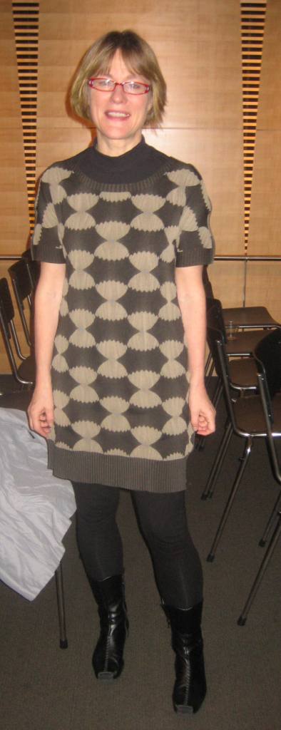
Jean is wearing: Thursday: Black cotton turban by Amy Downs NYC (A Uno); vintage bakelite chain necklace, Romeo and Juliet tie-dyed shiburi shawl top, black linen harem pants from a Tibetan store in the East Village; Revue glasses. Sunday: Same turban and glasses plus: Derek Heart grey cotton shirt; Donna Karan long wool shawl sweater; black knit harem pants from street vendor on Houston Street; Trippen shoes (A Uno); Lux de Ville purse (Enz), and vintage bakelite rings.
* * * * * * * * * * * * * *
BONUS PHOTOS
As Jean noted, we were not permitted to take photos of the textiles inside the Knoll exhibition, so we can't show you any of Jhane Barnes' weaves for Knoll. She spent more than a decade working with Knoll, but has designed menswear independently since 1981. Menswear can be pretty simple stuff, so textile weaves and color combinations are central to Jhane's apparel. Jean and I have both worn Jhane's shirts and sweaters for men, sticking in shoulder pads to take up the extra material. Just to amuse you, below are three examples of Jhane's menswear textiles.

Barnes has strong associations with Japan. Many of her textiles are woven there (some on a unique highly advanced computerized loom in Tokyo that no one is allowed to see for fear that it might be copied), and Jhane's husband, as previously noted, is also Japanese. This design, from a cotton knit sweater, shows variations of the futatsudomoe and mitsudomoe (double and triple commas), both old and respected Japanese crests. In antiquity, a large jade comma was said to be one of the original imperial regalia.

Here's the reverse side of the textile. The double-faced knit gives the material a variety of textures and dimensionality, and the interplay of the colors adds to the visual appeal.

For Neiman Marcus' 90th anniversary, Jhane was commissioned to do an exclusive commemorative shirt. To evoke Neiman's Texas roots, Barnes did a shirt with a pattern of galloping horses. Here is a single repeat of the face of the fabric.

Here is the reverse side of the same repeat. This is a double-faced weave, so the dark blue horse on the front becomes the white horse on the reverse, the white horse turns over to become the dark blue horse, and the pale blue horse on the front becomes the lapis blue horse on the reverse. The weaves are equal, so actually either side could be the face.

This wild and intricate color play would not be possible - or would be prohibitively expensive - if it weren't for computer design. Even so, programming computerized looms to do multicolored and multilayered weaves takes much more time than programming for one or two colors and a simple weave, so Barnes' products are in the high-end market, and made in small numbers.
AND AS IF THAT WEREN'T BONUS ENOUGH...

London (CNN) -- A hat that created a stir when Britain's Princess Beatrice wore it to last month's royal wedding sold for more than $130,000 Sunday in an online auction to benefit charities for children.
The rose-colored hat spawned numerous blog posts, along with a Facebook page -- "Princess Beatrice's ridiculous Royal Wedding hat" -- with more than 143,000 "likes."
Beatrice donated the hat to be auctioned online on eBay.com, with proceeds to benefit the charities. The listing describes the silk hat as a "unique sculptural celebratory headpiece."
"I've been amazed by the amount of attention the hat has attracted," Beatrice is quoted as saying in the auction listing. "It's a wonderful opportunity to raise as much money as possible for two fantastic charities. I hope whoever wins the auction has as much fun with the hat as I have."
Although some on the hat's Facebook page had predicted a last-minute bidding frenzy, the winning bid of 81,100.01 pounds (about $131,341) was placed hours before the end of the auction.
Beatrice, the daughter of Prince Andrew and Sarah Ferguson, the Duchess of York, wore the hat to the April 29 wedding of Prince William and Catherine Middleton. It was designed by milliner Philip Treacy.
"A truly individual, fun but elegant wedding bow becomes the fascinator form," says the description in the auction listing. "This statement piece is worn on the front hairline secured by a clear wire headband that is easily disguised by the wearer's hair. This is a gravity-defying hat."
The listing also shows some of the tongue-in-cheek photos created and posted online, such as one with a cat crawling through the front of the hat. It also inspired a tribute song.
Proceeds from the auction benefit The Little Bee Initiative, a campaign set up by the princess to benefit UNICEF UK and Children in Crisis, according to the listing.
"I've been surprised by the overwhelming response to 'the hat,' " Treacy said in the auction listing. "... I'm delighted, flattered and touched by HRH Princess Beatrice's decision to donate the hat to charity. I hope that people all over the world will be generous and that this hat will benefit many."
The auction was managed by Auction For A Cause, an auction management service that specializes in "high-profile promotional auctions for charities, nonprofit organisations and brands," according to the listing's frequently asked questions.
Bidders were required to be preapproved, according to the listing, and at least 18 years old.
Reaction to the auction on the hat's Facebook page was positive.
"Gracefully done, Princess B," one poster wrote, "auctioning off the monstrosity for a good cause with dignity and humor."
"Absolutely fabulous!" another person wrote. "How cool is she for doing this?"
(article from CNN.com; photo from the Sydney Morning Herald)
Jean says: Valerie's posting of Princess Beatrice's Philip Treacy hat is in perfect keeping with the Bard Graduate Center's upcoming exhibition Hats: An Anthology by Stephen Jones. Bard's Gallery Programs Spring 2011 edition features a photo of a hot pink feather hat by Philip Treacy from 1995. For the record, I loved Beatrice's hat!
For the record, says Valerie, I didn't. There are some hats which, when we find them in our wanderings, we might otherwise fight over if it weren't that we have already agreed in principle that we may borrow one another's hats. (We have each passed the other's stringent tests for the correct ways to handle hats). This is a hat that I could give up graciously, and never ask to borrow.
FINAL BONUS:
Click here for a look at an assortment of other Philip Treacy hats. And click here to see an assortment of Stephen Jones hats.

Another fascinating post; love the Jhane Barnes fabrics. And isn't Princess Beatrice the young trailblazer? massive public criticism of her for the Treacy butterfly hat she wore 3 years ago evidently did not cause her to lose faith in her own sense of style. No wonder they call her (with admiration) Princess Gaga. In this vid she confirms giving Treacy carte blanche for the design of the notorious beige wedding hat.
ReplyDeletehttp://abcnews.go.com/Nightline/video/millinery-madness-13496552
I can't wait to see what this York princess will come up with next.
i love the mina perhonen coat brooke hodge wears, it is one of their prints which i most adore! lucky woman!
ReplyDeleteGreat post I must say.. Simple but yet entertaining and engaging.. Keep up the good work!
ReplyDeleteMens hats
Men's hats